What are the colours to avoid when painting your home?
Posted on: 2024-12-30
When it comes to painting your house, the colours you choose can significantly impact the overall ambiance and even your mood. While some colours can enhance a space, others may detract from its appeal or affect your well-being. In this blog, we will explore the colours to avoid in various rooms of your house, helping you make informed decisions that contribute to a harmonious living environment. Before diving into specific colours to avoid, it’s essential to understand the concept of colour psychology. Colours can evoke emotions and influence perceptions. For instance, warm colours like red and yellow can energise a space, while cool colours like blue and green tend to create a calming atmosphere. Choosing the right colour for each room is crucial to achieving your desired effect.
Colours to Avoid in Different Rooms in Interiors
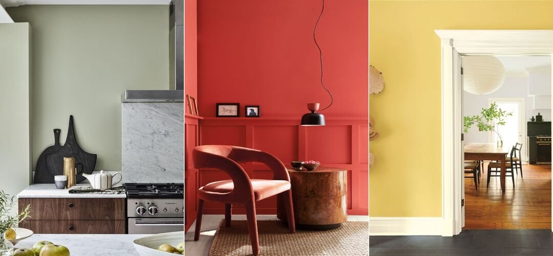
1. Living Room: Bright Yellow and Dark Brown The living room is often the heart of the home, where families gather and entertain guests. Therefore, it's vital to choose a colour that fosters a welcoming atmosphere. Bright Yellow: While yellow is associated with happiness and positivity, bright or neon shades can be overwhelming in a living room. They may create an overly stimulating environment that makes it difficult for you and your guests to relax. Instead, consider softer shades like buttery yellows or warm neutrals that maintain brightness without the harshness. Dark Brown: Dark brown walls can make a living room feel heavy and closed-in, especially in spaces with limited natural light. This colour absorbs light rather than reflecting it, creating a sombre atmosphere. Opt for lighter shades of taupe or beige that provide warmth without feeling oppressive. 2. Kitchen: Slate Grey and Bright Red The kitchen should be a space that inspires creativity and comfort while being functional. Slate Grey: This colour can make your kitchen appear dark and uninviting. It lacks the warmth typically associated with kitchen spaces, leading to a dreary cooking environment. Instead, consider cheerful colours like soft greens or warm whites that promote a sense of cleanliness and openness. Bright Red: Although red can stimulate appetite, using it as a dominant colour in the kitchen may create an intense atmosphere that feels chaotic. Instead of painting all walls red, consider using it as an accent colour through decor items or smaller features. 3. Bedroom: Black and Mint Green Your bedroom should be a sanctuary for rest and relaxation, so colour choice is critical. Black: While black can add sophistication when used as an accent colour, painting an entire bedroom black can lead to feelings of sadness or depression. The intensity of black may also create an oppressive atmosphere that hinders restful sleep. Instead, opt for calming colours like soft blues or gentle greens that promote tranquillity. Mint Green: Although mint green is trendy, it has been found to decrease home value according to real estate studies. This pastel shade may not provide the serene environment you desire for sleep. Consider deeper hues like sage green or muted earth tones that are both soothing and appealing. 4. Home Office: Cool White and Bright Yellow A productive home office requires careful consideration of colour choices. Cool White: While white can create a clean look, cool-toned whites often feel sterile and impersonal, resembling a clinical environment. This feeling can stifle creativity and productivity. Instead, opt for warm whites or soft greys that create a more inviting workspace. Bright Yellow: Similar to its effect in living rooms, bright yellow in an office can be overly stimulating and distracting. It may lead to eye strain when paired with artificial lighting. Consider using muted yellows or earthy tones that encourage focus without overwhelming the senses. 5. Bathroom: Dark Forest Green Bathrooms should evoke cleanliness and relaxation; therefore, colour choice is crucial. Dark Forest Green: While deep greens can add elegance when used appropriately, they can also make small bathrooms feel cramped and dark. This colour absorbs light rather than reflecting it, creating an uninviting space. Instead, consider lighter greens or soft blues that promote calmness while making the space feel larger.
Top 3 Exterior Colours to You Must Avoid
The exterior of your home creates the first impression for visitors and potential buyers alike. Choosing the right exterior paint colour is essential for curb appeal. 1. Brown Brown may seem like a safe choice; however, studies have shown that homes painted in brown hues tend to sell for less than homes painted in lighter colours like white or beige. Brown can make your home appear dated and unkempt when compared to fresher tones. 2. Dark Colours (Black/Navy Blue) Dark colours such as black or navy blue may absorb heat in warmer climates, leading to increased energy costs for cooling your home. Additionally, these colours can highlight imperfections on your home's exterior rather than camouflage them effectively. 3. Neon Colours While vibrant colours may appeal to some homeowners looking for uniqueness, neon shades are generally off-putting when it comes to resale value. They can clash with neighbouring homes’ aesthetics and deter potential buyers who prefer more traditional palettes.
Why is it best to choose the right paint colours for your home?
Choosing the right paint colours for your home is crucial not only for aesthetics but also for creating an environment conducive to relaxation and productivity. By avoiding certain colours—such as bright yellows in living spaces or dark browns in kitchens—you can enhance your home's appeal while ensuring it remains a welcoming sanctuary for you and your family. When considering paint colours, think about how they affect mood and perception within each room of your house. Always remember that personal preference plays a significant role; however, being mindful of these general guidelines will help you make informed decisions that elevate your home's overall ambiance.
Wrapping up
Ultimately, whether you're preparing your home for sale or simply looking to refresh your space, understanding which colours to avoid will guide you toward creating an inviting atmosphere that reflects both style and comfort. This blog post incorporates relevant SEO keywords while providing valuable insights into paint colour choices for various rooms in the home. It maintains a professional tone while ensuring readability for all audiences.